Tag: design

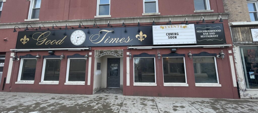
  • Good Times Neighbourhood Bar and Restaurant

    Part I: Exterior Fascia Sign

    Working under Erb Signs in Woodstock, ON, I was approached by a client looking to open a New Orleans-inspired restaurant and bar in the downtown area of the city.

    The goal was to take the client’s existing logo and adapt it into a fascia sign that would fill the available space on the storefront. The long, thin sign area did not match the proportions of the logo, so I opted take the core elements of the logo– the clock and fleur-de-lys– and pair them with a new typeface which could fill the space.

    I retained the same colour scheme as the existing logo, though opted for a black background to help showcase the gold accents and provide a sense of elegance and professionalism to the storefront.

    The client’s existing logo that was used as inspiration for the fascia sign

    The client had decided to keep a readograph sign that the previous tenants had left behind, which I then incorporated into the new design. I created a separate decorative element for the “Neighbourhod Bar and Restaurant” tagline, and placed it on the opposite side of the readograph sign to help unify the design.

    Part II: Interior Wall Mural

    After the installation of the fascia sign, the client came back to us looking to fill a 19 foot long interior wall space near the restroom.

    At this point, the client had opted to use lime green accents for the interior decor to simulate a New Orleans/Mardi Gras aesthetic, so the goal for this design was to harmonize those elements with the black/white/gold colour palette that had been chosen for the logo and the exterior signage on the building.

    The client was inspired by wall murals featuring collages of famous musicians, however we were concerned about copyright, image quality, and design costs for a wall of this size.

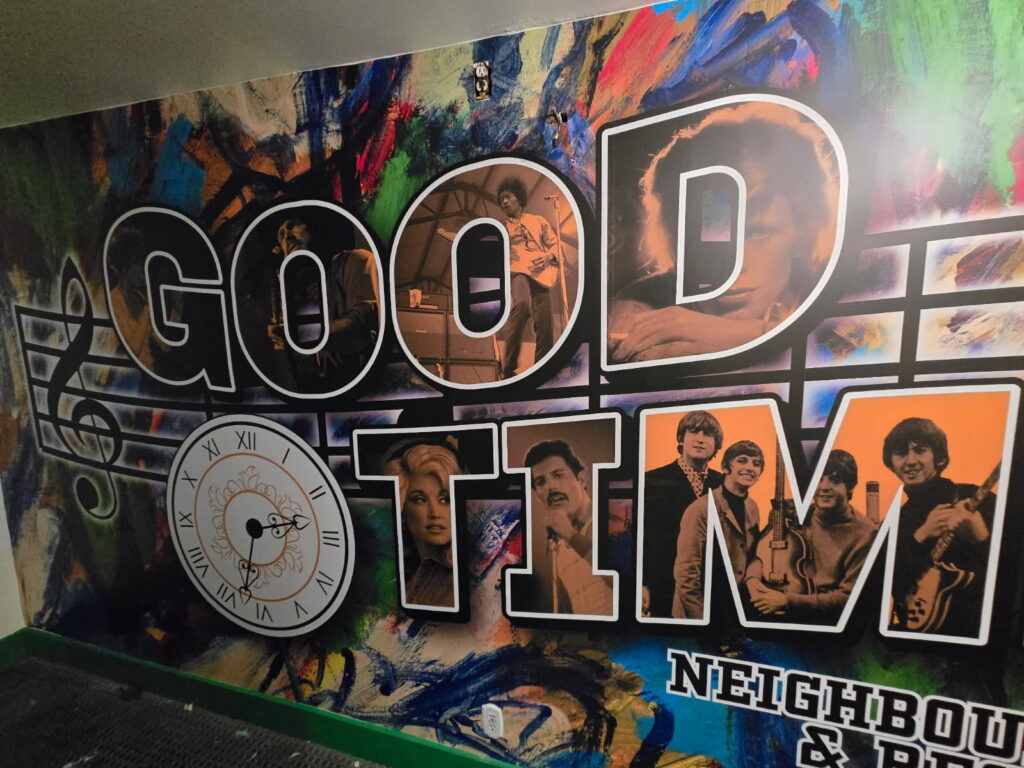
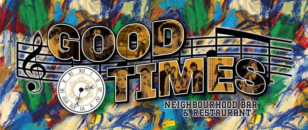
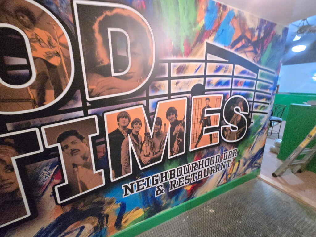
    To simplify the design, I proposed that we use a limited amount of public domain images as the centrepiece, which I masked into the gold-tinted letters of “Good Times” to match the logo. I found several copyright-free images of musical icons to incorporate into the mural.

    The colourful stock background includes green and gold to unify the colour scheme and keep in theme with the revelry of Mardi Gras. The foreground elements were simplified so the design had room to breathe.

  • Draplin-Inspired Collage Posters

    Part I: BCI Poster

    Created in my senior year of high school, this project for my Information/Consumer Design class involved selecting a famous graphic designer and recreating something in their style. I chose Aaron Draplin and reimagined his commemorative city and state tour posters as a tribute to my high school.

    This poster features over 130 custom emblems and icons highlighting my time at the school as well as its proud history, culture and other iconic elements. The school’s colours, blue and gold, are used to tie disparate elements together and create a sense of unity throughout the controlled chaos of the dense design.

    This project taught me patience and planning when building smaller parts of a larger whole, how to use masters of design as reference to create something personal and new, as well as how important incorporating love, care, and several distinct sources is to creating something expansive, modern, and nostalgic.

    Through simplifying concepts into something instantly recognizable to its core audience, I expanded my abilities and perceptions as a designer.

    Part II: Inktober 2022 Poster

    In a similar vein, this design imitates the layout of the previous poster as a contribution to Inktober 2022, an artist’s challenge consisting of a prompt-a-day for the entire month of October. This three-colour poster showcases all 31 prompts in a grid format, with the text version of the prompts listed in order at the bottom.

    This time, this poster style was used to add an additional challenge to Inktober, working within specific shapes and limiting colour choices to add complexity and create an overall sense of stylistic cohesion, also mimicking the black ink traditionally used for the challenge.

    As this was my fourth time participating in Inktober, the goal was to elevate the project beyond previous years and create a new way to improve my skills as a designer. See if you can match all 31 prompts to their artwork!

  • “Perpetua” Custom Typeface

    This custom typeface was developed as the summative project for the GCM 806: Advanced Typography course at Toronto Metropolitan University.

    The goal of this project was to develop a consistent and holistic character set to fulfill a stylistic vision, to reinterpret several base elements into a full alphabet, and to optically balance glyphs for maximum visual appeal.

    This typeface received recognition on Episode 146 of the graphic arts-focused podcast Talk Paper Scissors, titled “Emerging Typeface Designers Nicole Galindo & Cameron Mady” for its excellence.

    Perpetua is a bold display typeface designed to draw the eye, tying back to retro styles while having a modern and screen friendly flair. It is distinctive yet familiar, marrying a love for old school designs with a fresh faced upgrade.

    Perpetua has a simple, rigid and geometric structure with enough contrast to give its traditional feel a little more style.

    Unique characters include rounded letters like O, Q, G, R, U, and G thanks to its angular build, and the typeface caters to readers looking for something mature/dependable yet fun, or those who love retro styles.

  • Alyssa Tess: Sweet Goodbye EP

    Part I: Cover Art

    Illustration work for indie contemporary singer/songwriter Alyssa Tess’ 2023 EP release for Sweet Goodbye, and companion single “Daydream”.

    The goal was to create a light, breezy, and flat hand-drawn style for the album where musical and thematic elements are incorporated into the wavy hair of the portrait.

    As a primarily vector-based designer, this project granted me the opportunity to experiment in a different medium and adapt my skills to properly fulfill the concept behind the final product.

    The process involved working remotely with the client through multiple iterations of the designs, developing a general colour palette, and using non- destructive editing to make and revert changes as necessary.

    This experimentation allowed me to build out a new design style to suit the needs of the client, making a cohesive and distinct visual language for the overall package.

    The single “Daydream” released on September 7, 2022.

    The Sweet Goodbye EP released on August 24, 2023.

    In addition to the cover art, I was also commissioned to create a shirt design to accompany the EP release.

    Part II: Merch Design

    This shirt design aims to reflect a more mature perspective surrounding the EP and its themes of longing, nostalgia, and progression.

    The imagery references the album’s third track, “Dandelions,” along with lyrics pulled from the EP’s title track, and a butterfly motif showcasing the ideas of change and growth, which are present across the album.

    Since the client aimed to print this design onto thrifted shirts, a more vintage style was used to reflect the medium of choice, and a one-colour design was used to both reduce print costs, and keep the design consistent across the different thrifted shirts.

    Raster assets were compiled through the manipulation of stock photos in Adobe Photoshop, with additional vector elements being produced in Adobe Illustrator.

  • Season of Drinks Poster Set

    This illustrative set uses classic drinks to represent the four seasons—hot chocolate for autumn, egg nog for winter, lemonade for spring and a fruity cocktail for summer. This acted as practice drawing fluid movement, designing for a series of illustrations, and working with colour to evoke recognizable imagery.

    These posters became part of an October 2020 charity fundraiser in support of the Red Cross combating COVID-19 and the Brantford Food Bank, helping me raise over $200 for both causes.

    I also created a collection of mock- ups in Adobe Photoshop to promote these prints during the fundraiser, showcasing the designs in a real-world context.

  • Moondoggy Shirt Designs

    Moondoggy Shirt Designs

    The goal of these projects was to develop T-shirt designs to coincide with the releases of the indie rock band Moondoggy’s 2023 debut album Mad and Noisy, and their 2026 follow-up album Around the Fire.

    Both shirts feature campground and wilderness inspired designs that reflect the laid-back and nostalgic sounds of their respective albums, paying homage to the band’s hometown of Collingwood, ON.

    These designs build off of the existing branding for each album, as both were designed after the album cover art had been created, but before the full albums had been released.

    The sound of the pre-release singles also influenced the direction of each shirt’s aesthetics.

  • Playing Cards

    Playing Cards

    These cards were designed as a pet project in the early weeks of the COVID-19 Pandemic, where one face card was designed each day over the course of several weeks.

    The goal of this set was to create symmetrical designs in a consistent art style that could pay homage to the traditional interpretations of playing card art.

    Each suit was designed with a distinct colour palette and theme, tying in the four classical elements and the societal classes of medieval times.

    The Clubs were designed after woodland creatures and the element of Earth, symbolizing the peasant class through their humble, muted and pastoral designs.

    The Hearts were based on sailors, sea life and the element of Water, representing the clergy through superstition and mythos.

    The Diamonds were designed after birds, resort life, and the element of Air, representing merchants through their lavish lifestyle.

    The Spades were designed after classical depictions of the underworld and the element of Fire, representing nobility through their stern stances. The Ace of Spades is also known as the “Death Card”.

    The Jokers are based on classic depictions of the moon from Georges Méliès’ silent films “A Trip to the Moon” (1902) and “The Astronomer’s Dream” (1898).

    In the Summer of 2024, these cards were printed in a limited run on Matte Linen Cardstock.

  • Portfolio

    Portfolio

  • Home

    Home

    Take your brand
    to the next level.

    Hi!

    I’m Cameron Mady, a graphic designer and brand strategist based in Brantford, ON. I deliver high-quality, professionally curated and intuitive design solutions that are catered to your brand, your business, and your story.