Summer 2025
ADK Strength and Conditioning
Dynamic branding solutions that pack a punch for a growing business
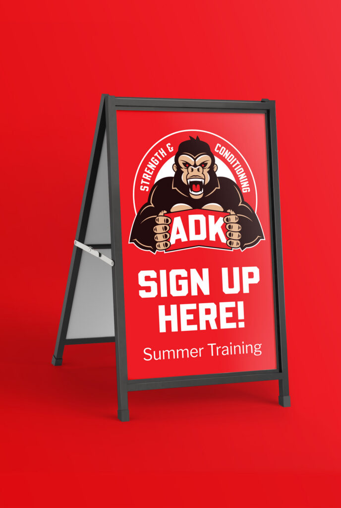
This project was completed while working under Erb Signs in Woodstock, ON. The client requested a logo for their business that featured the torso of a beast-like figure crushing the letters “ADK”.
I was initially concerned that this concept may be too complicated to be the sole logo design. I know from experience that complex logos can be restrictive and lead to additional pain points down the production line. The amount of colour and detail on a logo can make it difficult to scale to small sizes, or to fit spaces with extreme proportions.
I proposed that we develop a more robust branding system with several modular components that could be used in different contexts.
These additional logos share the colour scheme, iconography and art style of the primary logo, but allow for new use cases that add depth to the brand.
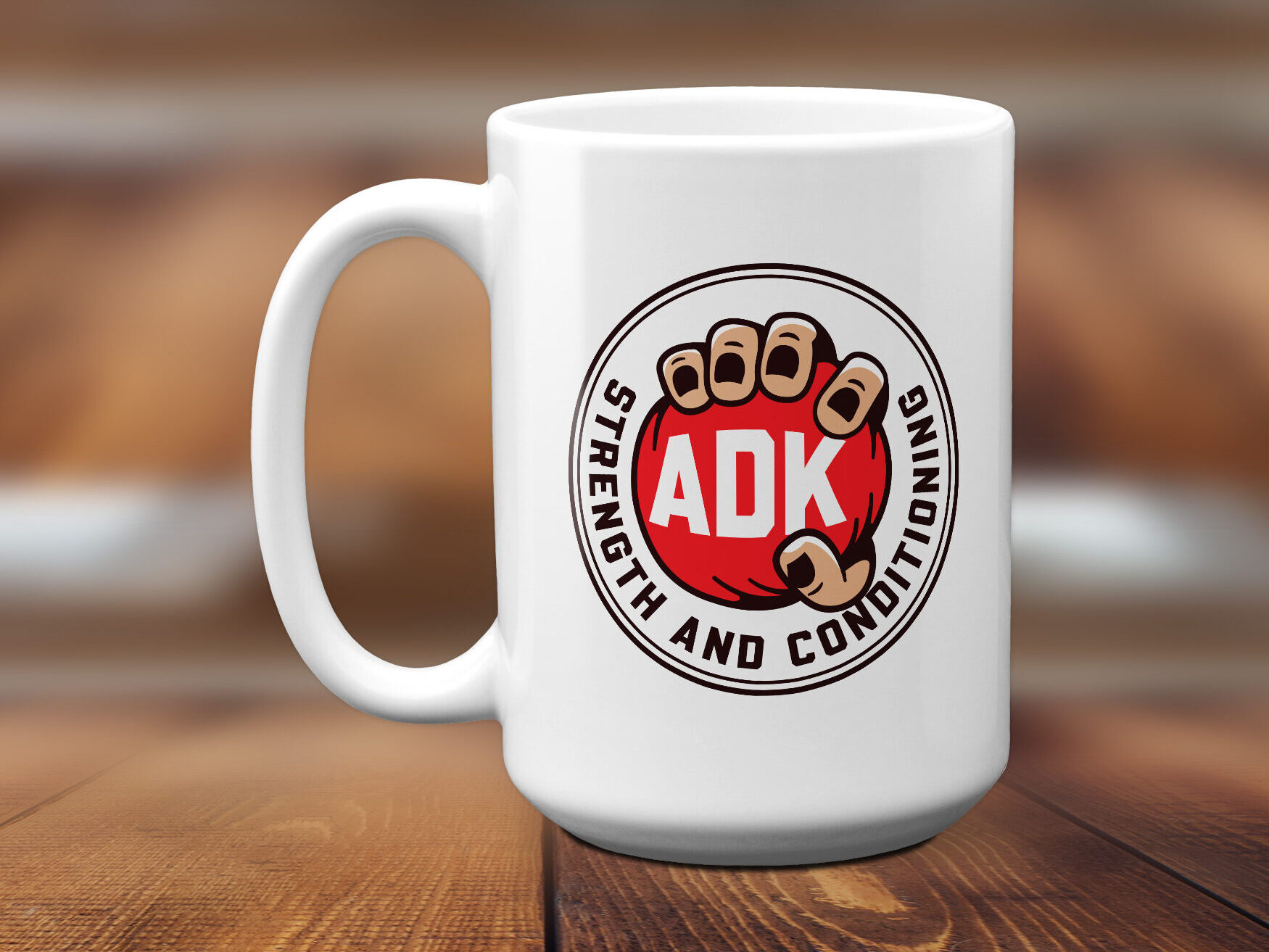
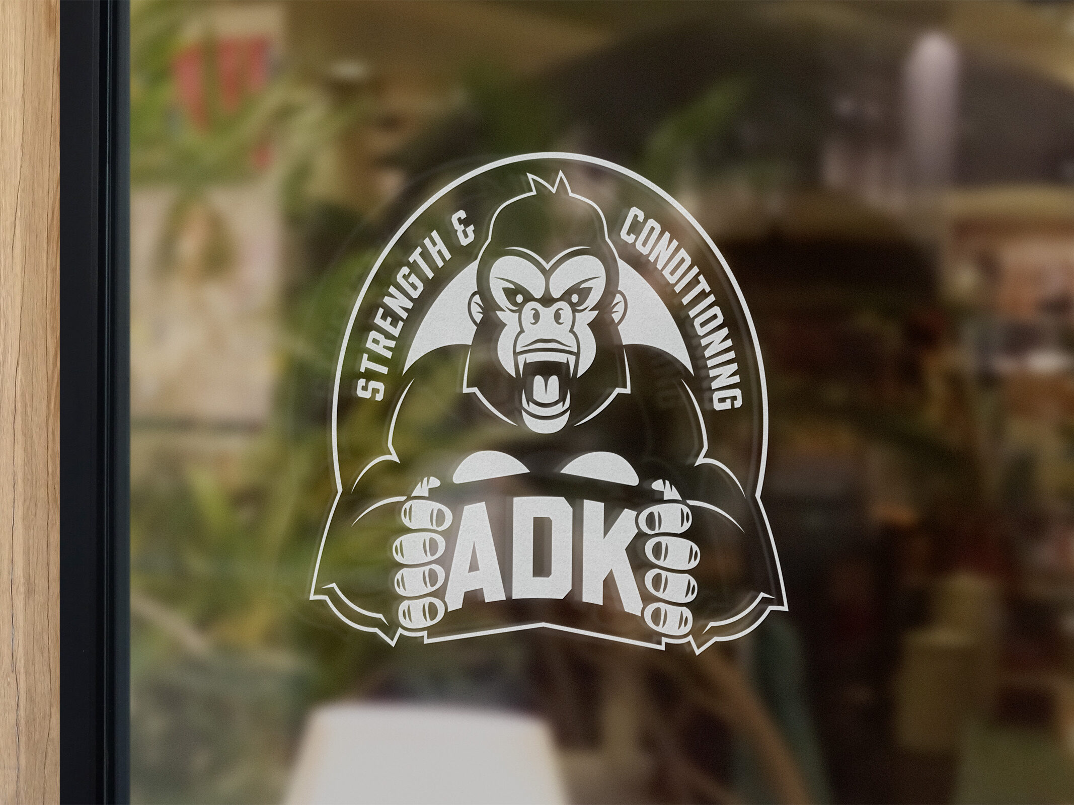
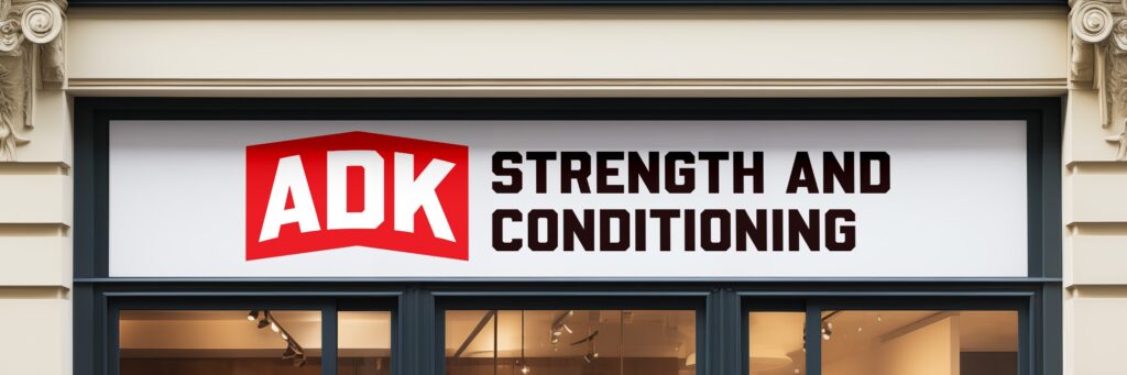
Having alternatives creates a more coherent identity for the business overall. The brand is not reliant on a single logo, instead having its own visual language that can connect to clients on a more substantial level.