Spring/Summer 2023
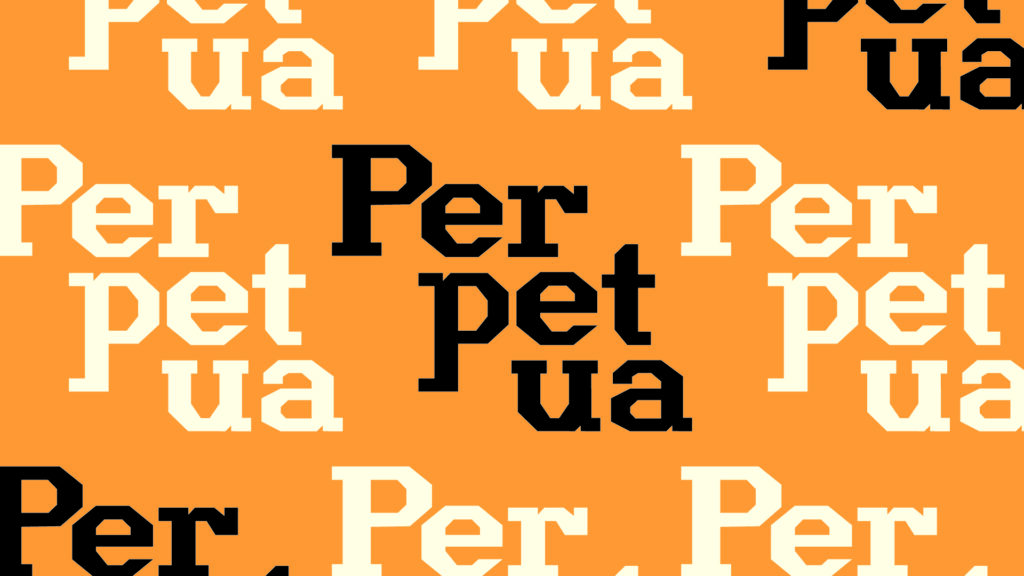
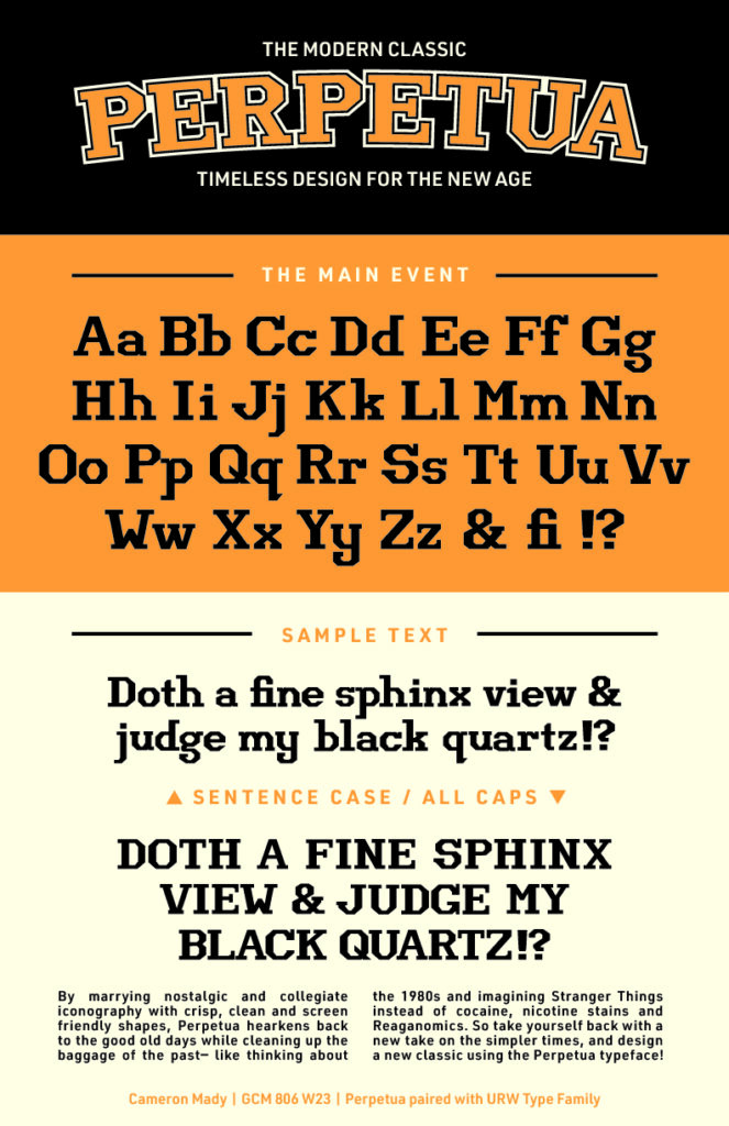
“Perpetua” Custom Typeface
A friendly, vintage-inspired typeface with a modern, screen-friendly appeal
This custom typeface was developed as the summative project for the GCM 806: Advanced Typography course at Toronto Metropolitan University.
The goal of this project was to develop a consistent and holistic character set to fulfill a stylistic vision, to reinterpret several base elements into a full alphabet, and to optically balance glyphs for maximum visual appeal.
This typeface received recognition on Episode 146 of the graphic arts-focused podcast Talk Paper Scissors, titled “Emerging Typeface Designers Nicole Galindo & Cameron Mady” for its excellence.
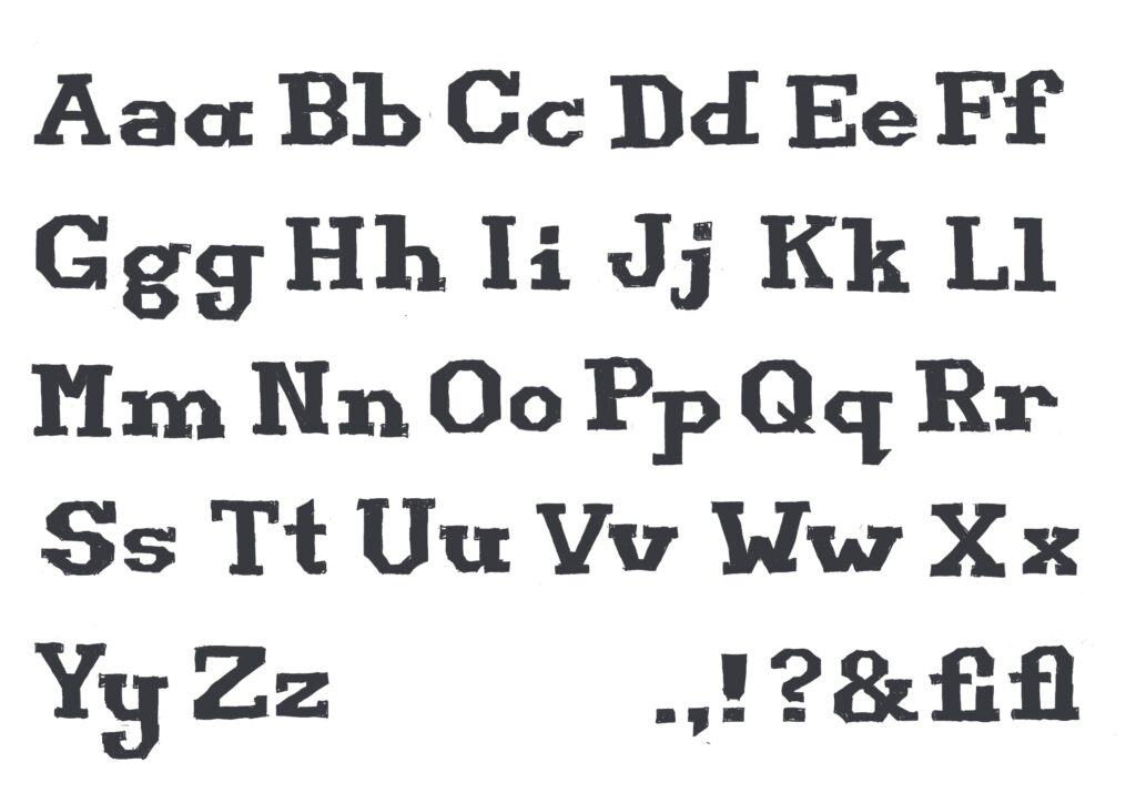
Perpetua is a bold display typeface designed to draw the eye, tying back to retro styles while having a modern and screen friendly flair. It is distinctive yet familiar, marrying a love for old school designs with a fresh faced upgrade.
Perpetua has a simple, rigid and geometric structure with enough contrast to give its traditional feel a little more style.
Unique characters include rounded letters like O, Q, G, R, U, and G thanks to its angular build, and the typeface caters to readers looking for something mature/dependable yet fun, or those who love retro styles.