
Winter 2025
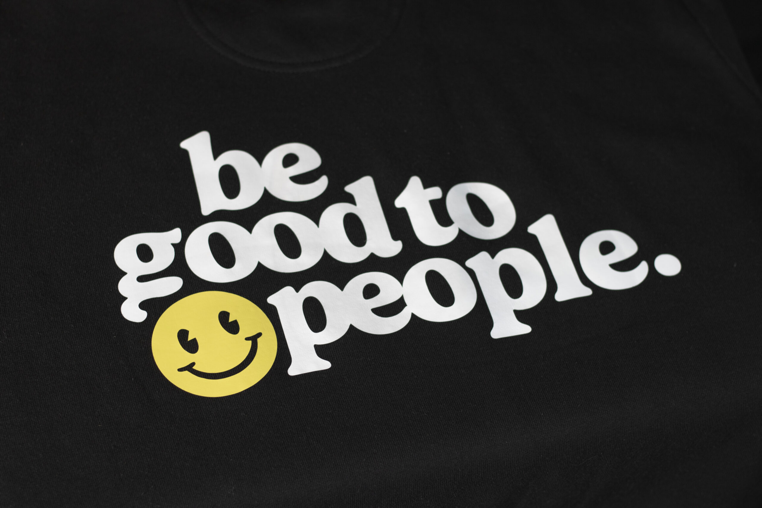
“Be Good to People” Apparel Design
Clean, high quality, vector splash illustrations for a beloved local brewery.
This double-sided sweater graphic was designed, cut and applied as an experiment with Heat Transfer Vinyl. After looking to expand my output options at home, and working with vinyl at my job, I purchased a Silhouette CAMEO 5 plotter.
This purchase let me experiment with my output in a way that wasn’t possible before, expanding my skillset and giving me control over the entire production process.
The goal for this design was to share a positive and inclusive message in a clean, wearable and appealing way. I wanted to spread kindness in a vintage, nostalgic and friendly typeface that could encourage others and cater to my own sense of style.