Spring 2019, Fall 2022
Draplin-Inspired Collage Posters
Two collections of vector graphics and iconography in a satisfying grid format
Part I: BCI Poster
Created in my senior year of high school, this project for my Information/Consumer Design class involved selecting a famous graphic designer and recreating something in their style. I chose Aaron Draplin and reimagined his commemorative city and state tour posters as a tribute to my high school.
This poster features over 130 custom emblems and icons highlighting my time at the school as well as its proud history, culture and other iconic elements. The school’s colours, blue and gold, are used to tie disparate elements together and create a sense of unity throughout the controlled chaos of the dense design.
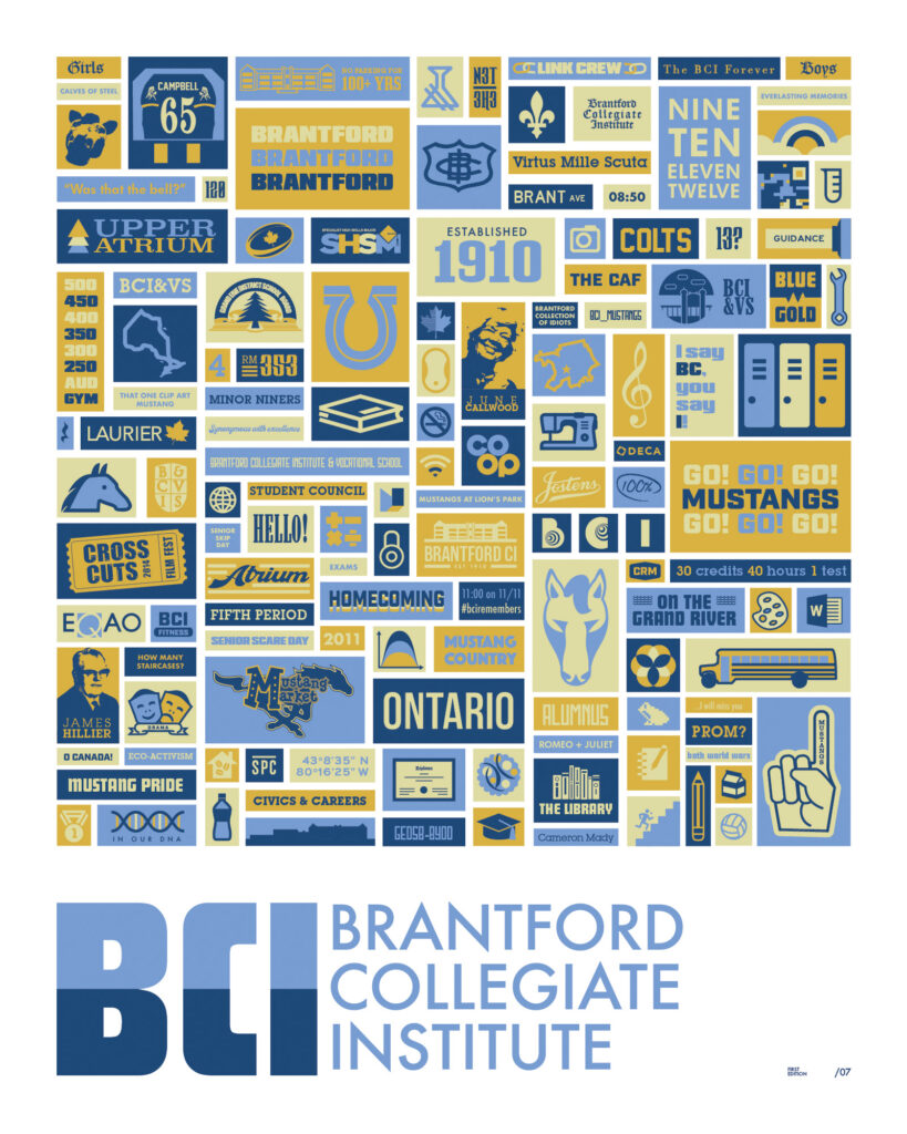
This project taught me patience and planning when building smaller parts of a larger whole, how to use masters of design as reference to create something personal and new, as well as how important incorporating love, care, and several distinct sources is to creating something expansive, modern, and nostalgic.
Through simplifying concepts into something instantly recognizable to its core audience, I expanded my abilities and perceptions as a designer.
Part II: Inktober 2022 Poster
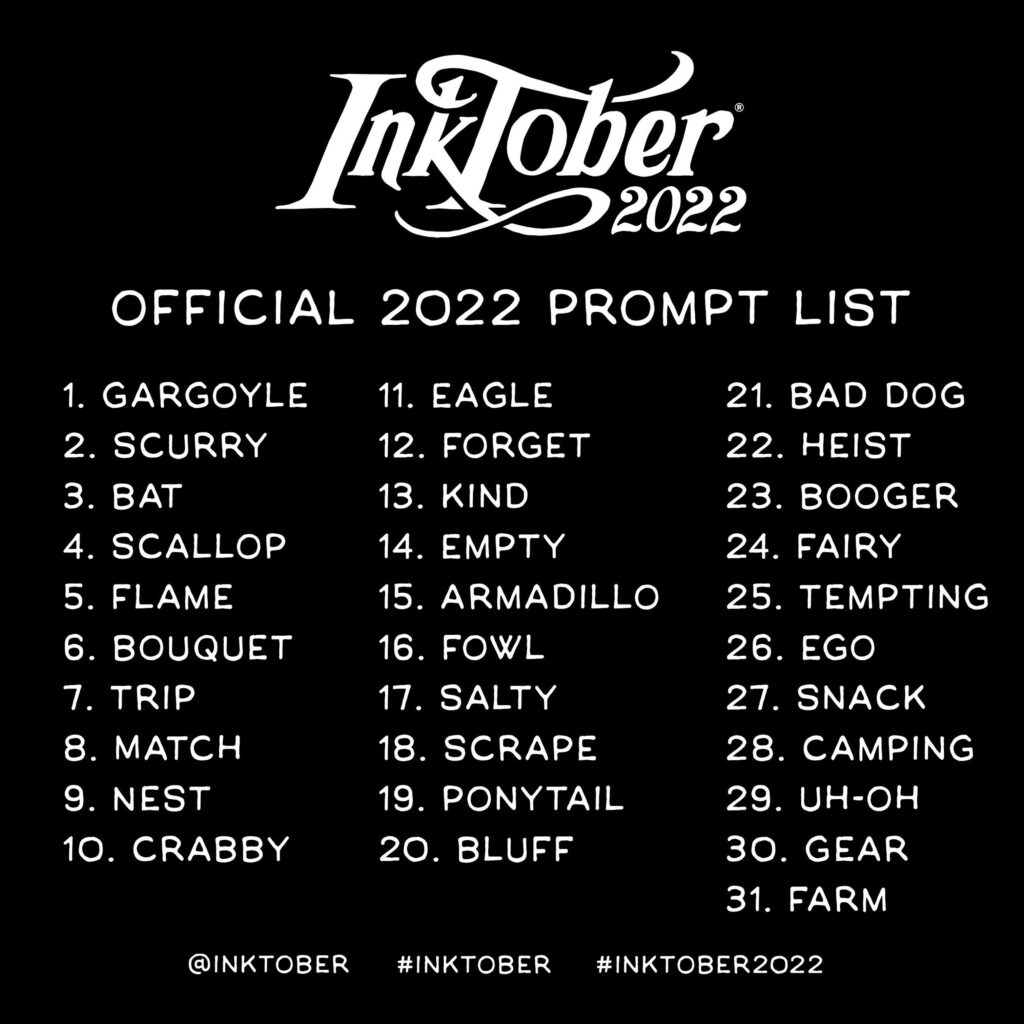
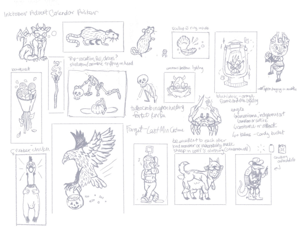
In a similar vein, this design imitates the layout of the previous poster as a contribution to Inktober 2022, an artist’s challenge consisting of a prompt-a-day for the entire month of October. This three-colour poster showcases all 31 prompts in a grid format, with the text version of the prompts listed in order at the bottom.
This time, this poster style was used to add an additional challenge to Inktober, working within specific shapes and limiting colour choices to add complexity and create an overall sense of stylistic cohesion, also mimicking the black ink traditionally used for the challenge.
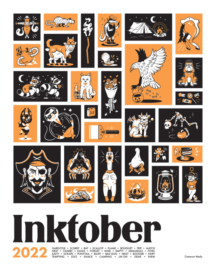
As this was my fourth time participating in Inktober, the goal was to elevate the project beyond previous years and create a new way to improve my skills as a designer. See if you can match all 31 prompts to their artwork!